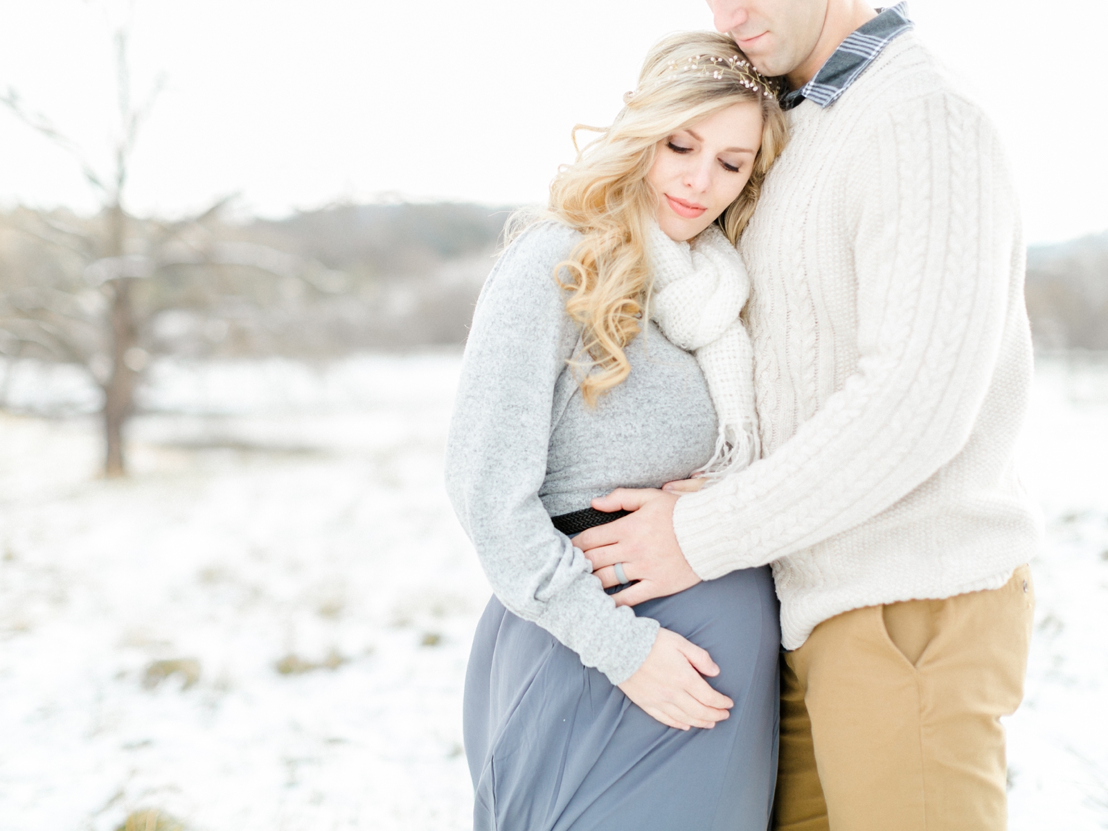
I absolutely LOVE when I get to photograph a couple’s wedding…but I love it even more when I also get to celebrate with them as they prepare to welcome their first child! Almost three years ago, I photographed Sarah and RJ’s beautiful wedding in Exuma in the Bahamas and now they are about to welcome […]
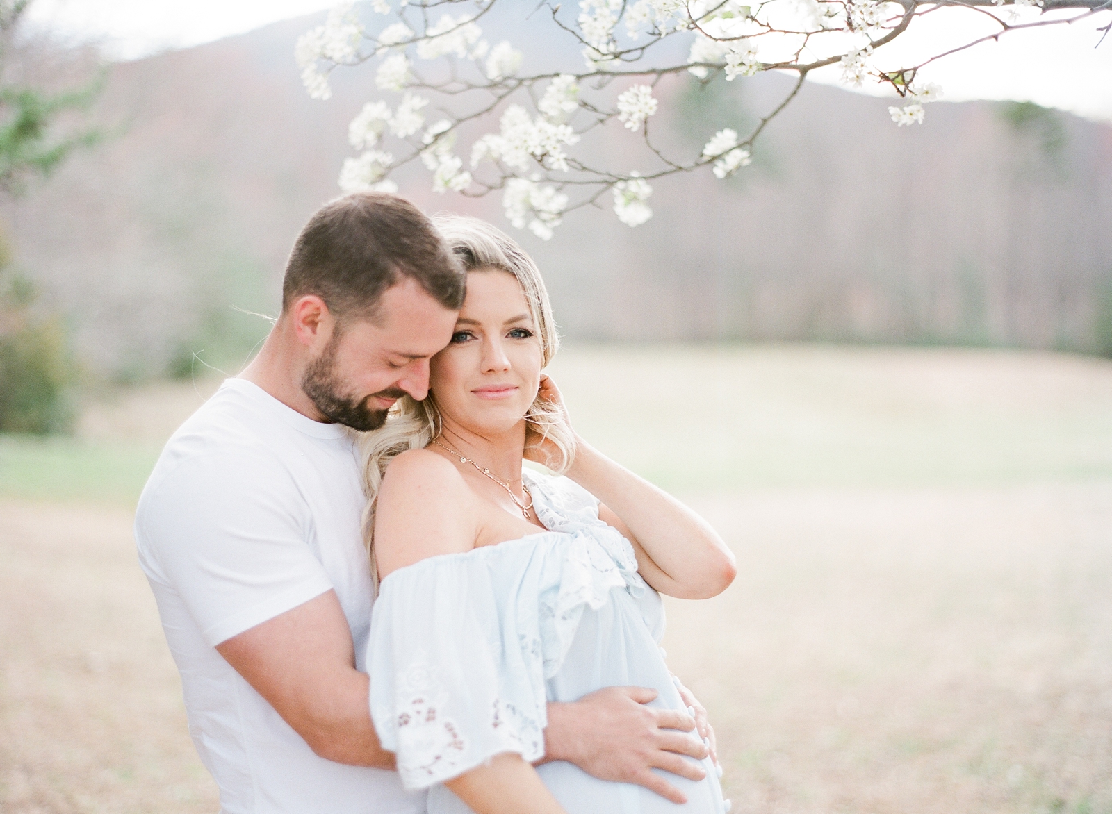
4/09/2019
READ THE POST
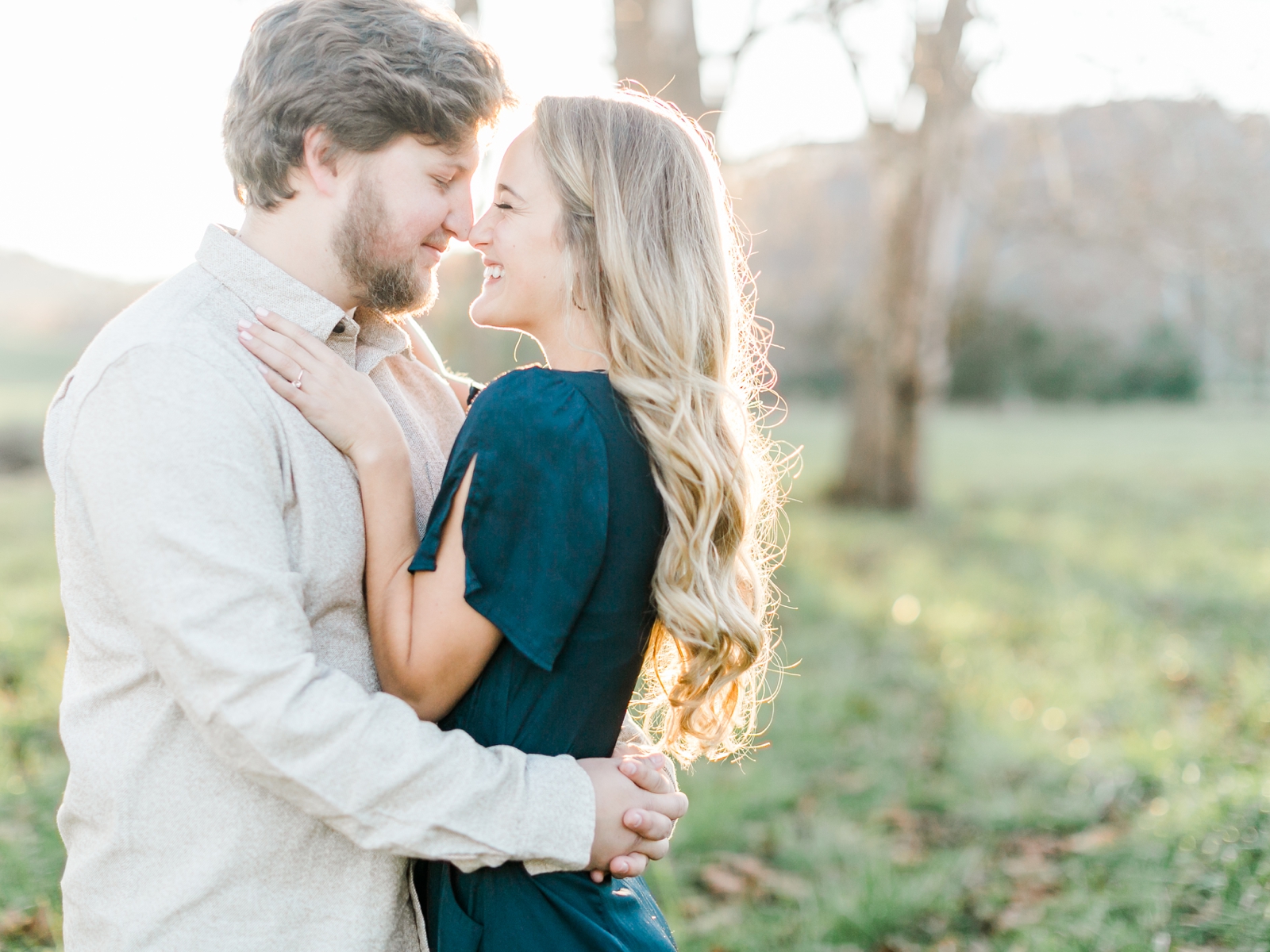
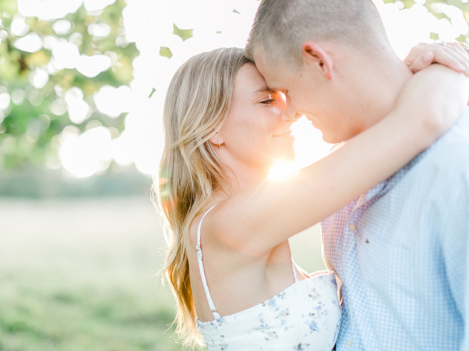
These two…and their FOUR adorable pups (!!) were so much fun to photograph!! We couldn’t have picked a more perfect day for their session on Fenwick Island and fingers crossed we get the same beautiful weather for their wedding next year at Pippin Hill Farm! Enjoy some of my favorites from our time together!
9/27/2018
READ THE POST
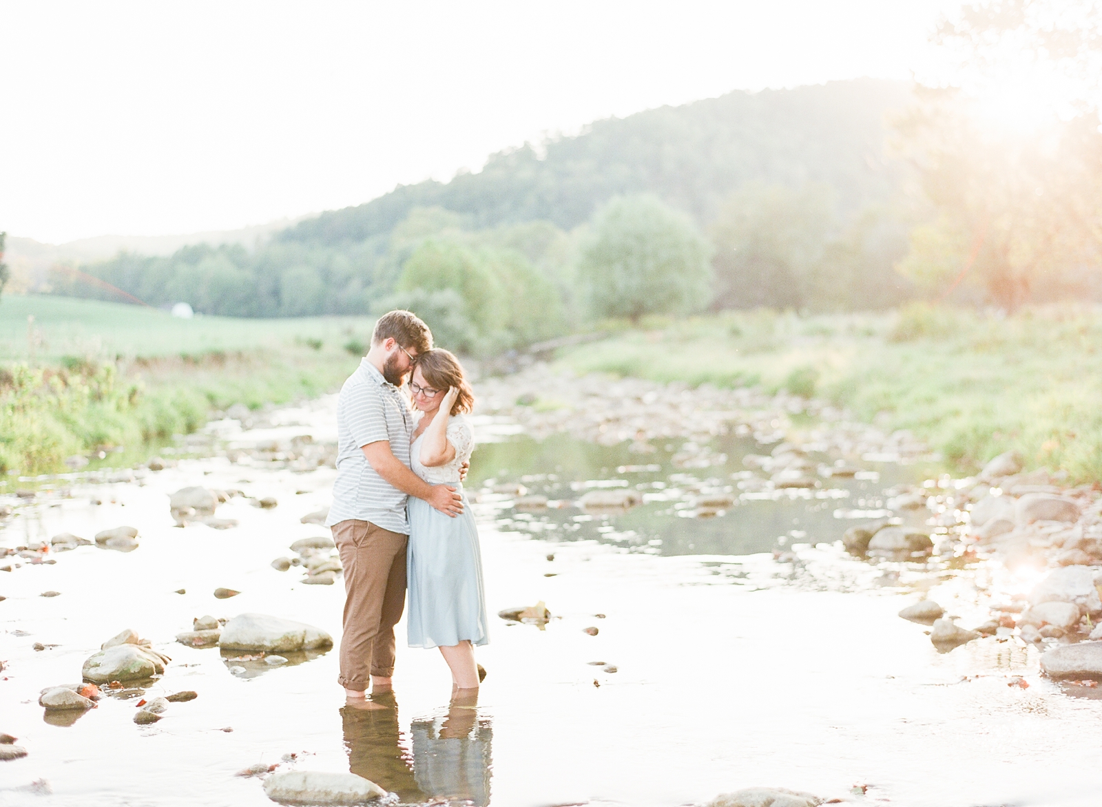
If you’ve followed any of Katelyn and Michael’s recent posts, you’d know that they are in one of the most difficult seasons of their lives! Katelyn is pregnant with baby James and he hasn’t been given very high odds of survival. It is SO hard watching friends go through such trying times, but we’re clinging to […]
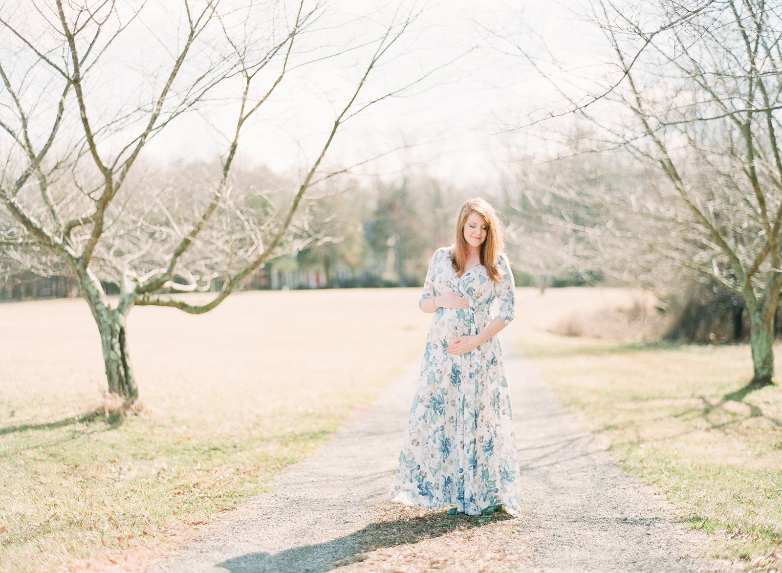
2/28/2018
READ THE POST